Introduction
Promat is at an important point in its brand history. As a strong member of the Etex Group, Promat aims to grow and strengthen its unique identity. Promat works daily with architects, engineers, specifiers, installers and contractors. Promat wants to protect people and buildings from destruction by fire. In addition, Promat makes energy consumption and thermal processes more efficient.


Sector
Construction
Services
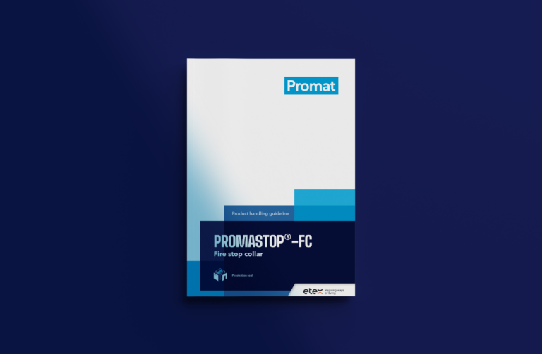
Iconen, Visual Design, Print Design, Packaging Design, Editorial Design, Print Design, UI Design, Social Media, Rebranding
Details


Promat's visual identity communicates the brand promise of safety and security. In this way, Promat aims to contribute to building a world that is safe, healthy and sustainable, while adding layers of knowledge and technology to communications to illustrate the visual world around us. This idea of adding value to the work of Promat's partners supports the new visual strategy.


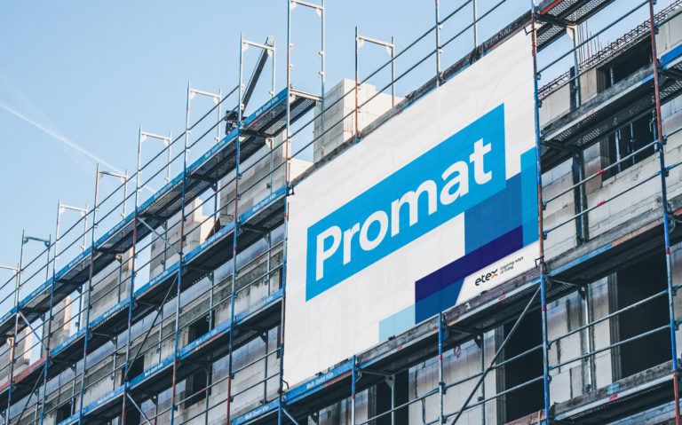
Promat's wordmark logo is strong in its simplicity and refers to 6 decades of know-how and expertise in passive fire protection. Promat's color palette is defined by the unique Promat blue that communicates calmness and stability. We widened the color palette to create additional creative opportunities for designers and brand managers.


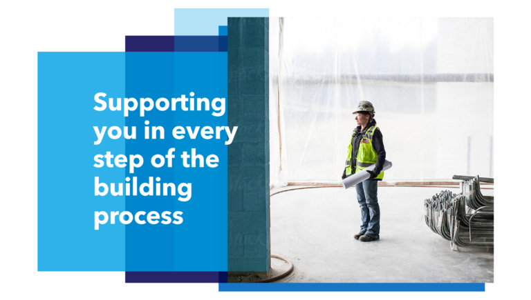
The images we use in communications play a crucial role in establishing a strong, contemporary brand identity. Promat wants to show how their solutions are used by partners and help protect iconic, innovative buildings and projects. Collaboration and enthusiasm core to their work.


The design principle symbolizes the way Promat sees its role as enabler and facilitator. We add layers of knowledge and technological products to a building or project. This principle reveals "the hidden genius" of Promat.

