Introduction
BOS+ is an organization dedicated to forest conservation, better forest and more forest in Flanders and the world. They work on themes that should be central to a broad social debate about sustainability and resilience of our biosphere and society.
Sector
non profit
Services
Print Design, Website, Web Development, Webdesign, Social Media, Rebranding, Online branding
Details

BOS+ believes that forests and trees are crucial, for everyone: animals, plants and people. Forests purify our air, encourage movement and are the ideal place to forget about our hectic lives for a while.
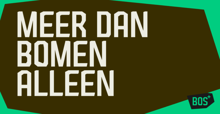
The baseline "more than just trees" on the one hand forms the basis for a straight forward & no nonsense communication style and on the other hand symbolizes the layered and diverse functioning of BOS+ as an organization.

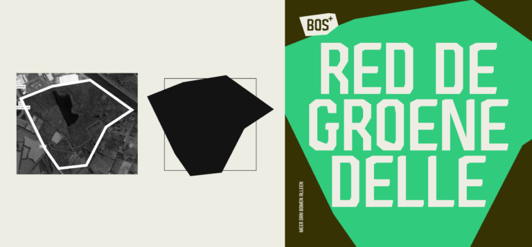
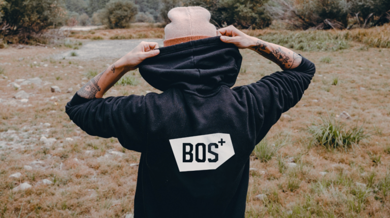
After almost 50 years, it was time for a refresh of the visual identity. The logo was inspired by the geographical areas where BOS+ operates. This changing shape forms the basis for the entire corporate identity.
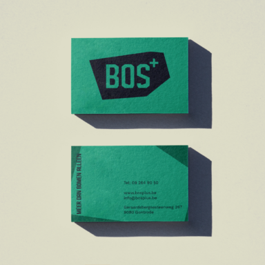

The color palette is a stylistic interpretation of all the colors in the forest throughout the seasons of the year. Together with the organically constructed typography, we inform, sensitize and activate where necessary.
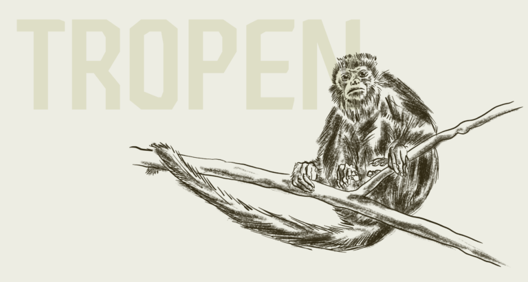
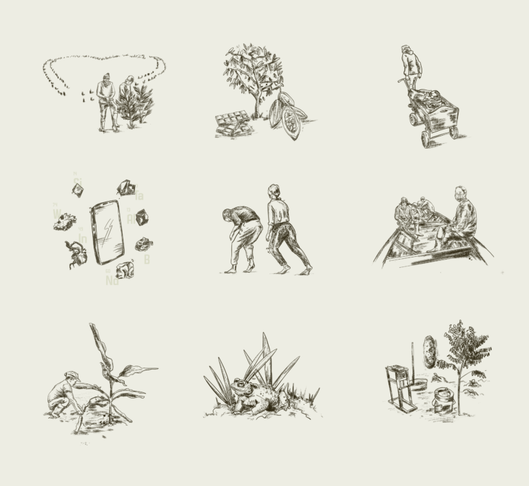
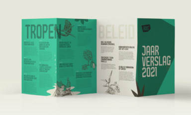
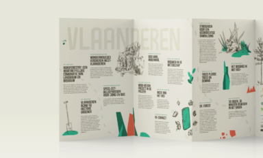
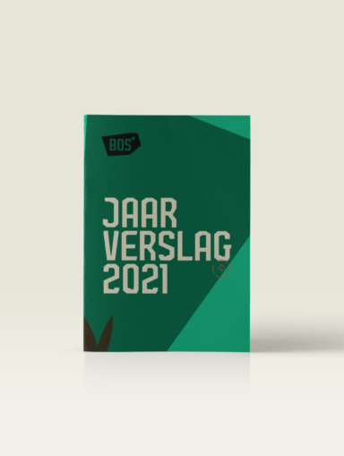
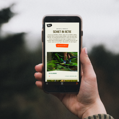
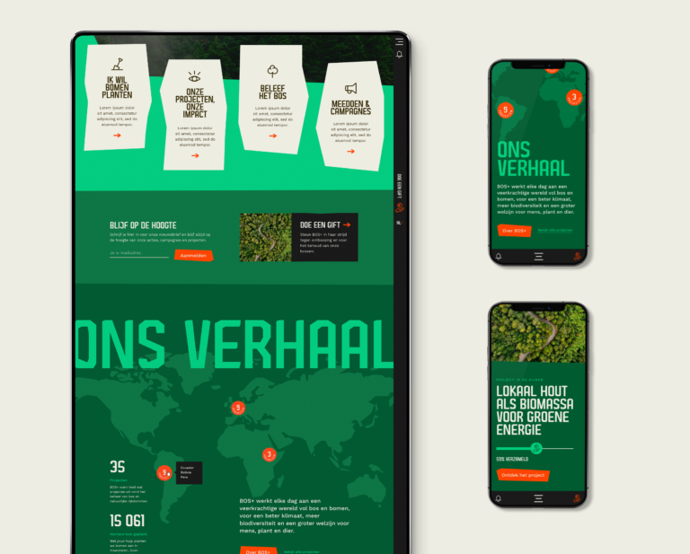
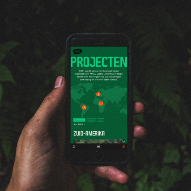
We developed a completely new website, a contemporary interpretation of half a century of knowledge, a platform full of information, tips, manuals, activities, educational material, events, actions, projects, hikes, bike rides and competitions, a green place on the worldwide web where every donor, company, teacher, partner, landowner or forest lover can find everything about forests and trees.



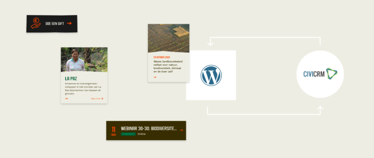
The wordpress cms system is built so that all departments within the organization can manage and modify content in a very focused way, behind the scenes the cms system is linked to CIVI-CRM to manage funds, target groups, newsletters, events, ... manage in a clear way.
